Workspace of the Week - Estee Lauder, London
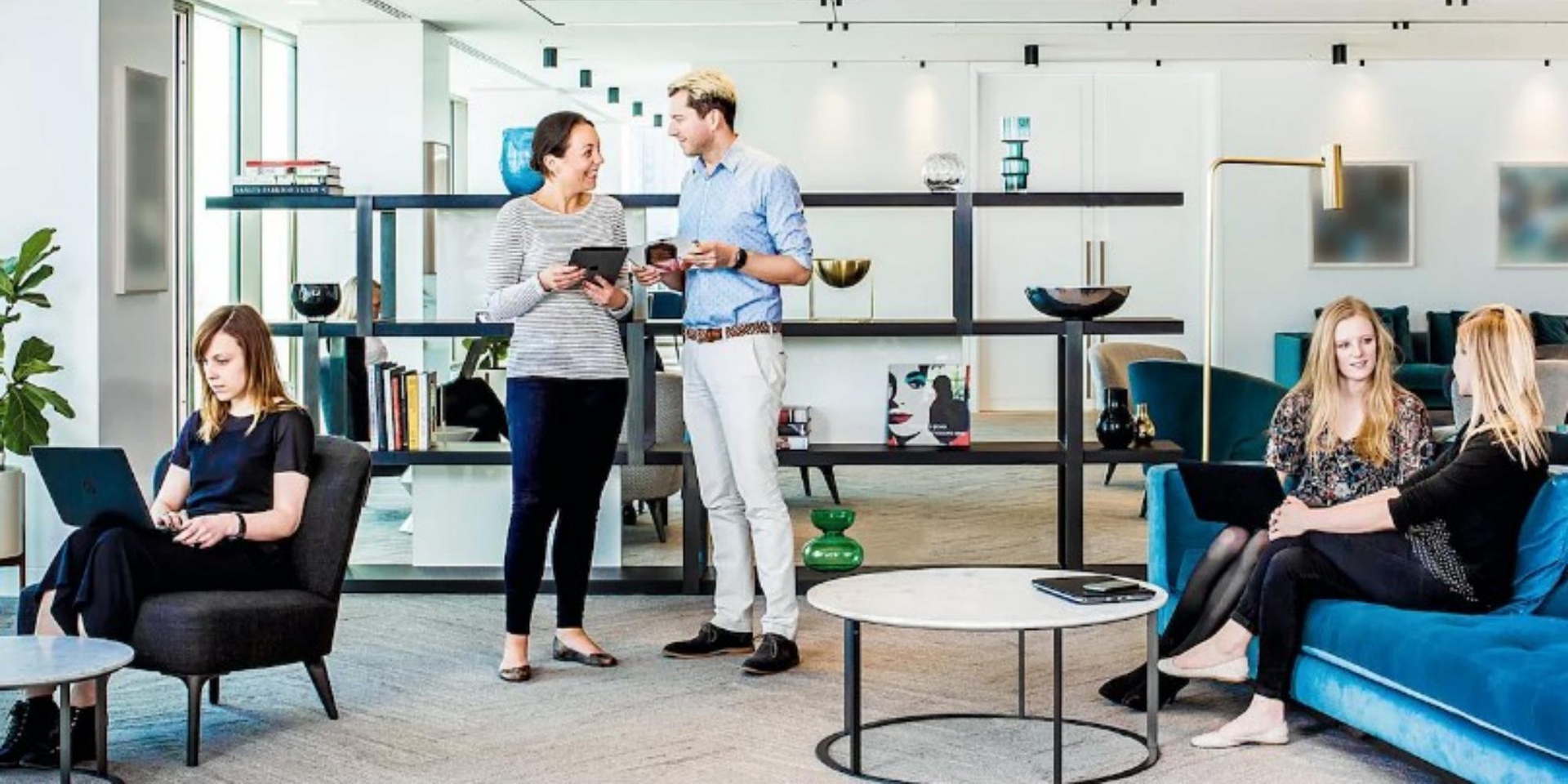
Estee Lauder's HQ has a very luxurious feel to it, perfectly reflecting the company's brand as well as connecting employees right the way through the building.
How do you improve collaboration, work-efficiency and retain talent for one of the world’s most prestigious beauty brands? Give the office a mass-makeover; revamp an 8-storey building and include a luxury salon, meditation space and nutritious café. Say hello to the beauty empire that’s flawlessly brought health and wellness in to the workspace.
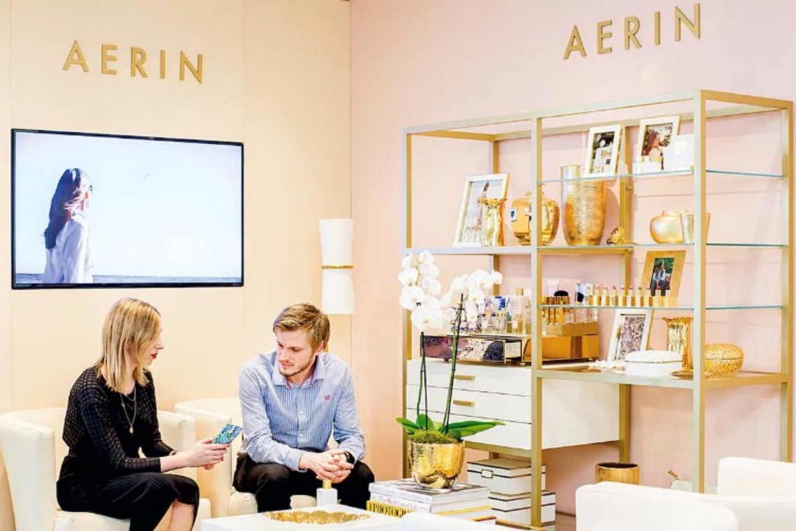
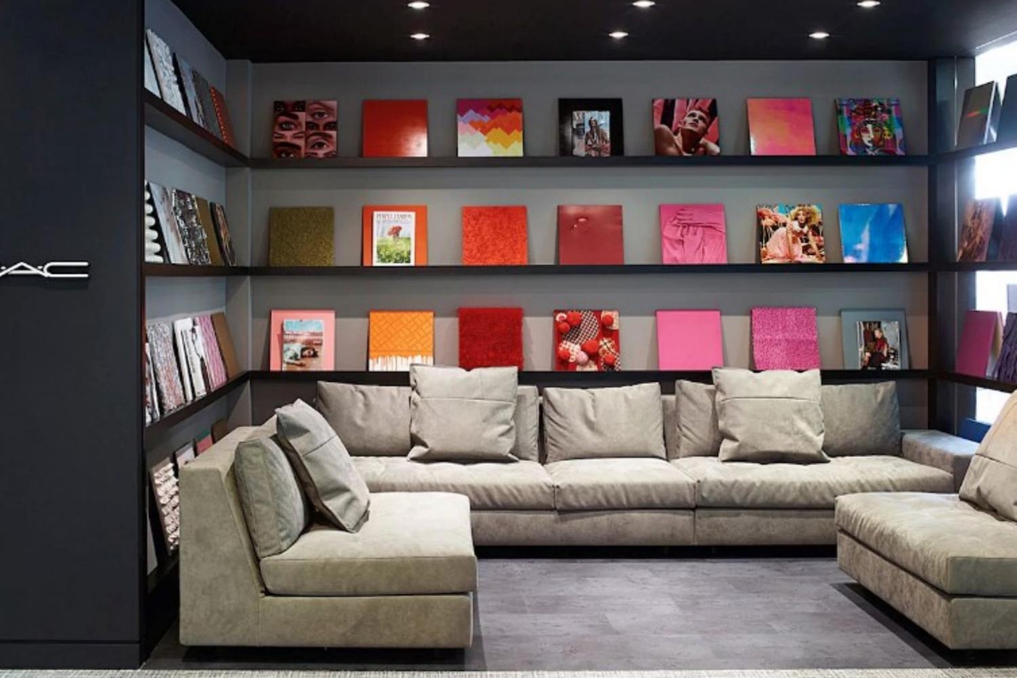
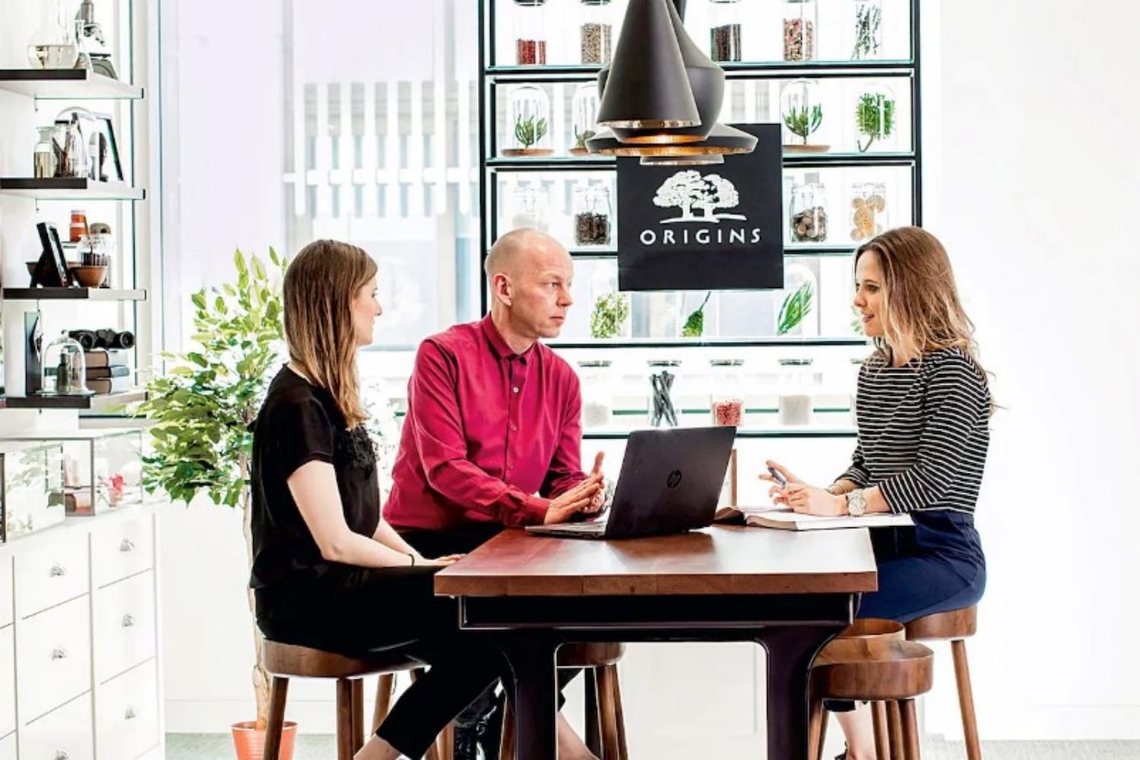
Estee Lauder used to be based across four buildings spread across the city. Now in the affluent area of Fitzrovia, Estee Lauder HQ houses its staff under one sumptuous and employee-focused roof. A luxury brand in itself, it also has an impressive portfolio under its belt such as Jo Malone, Clinique, Origins, M.A.C and Tom Ford, all of which have their own ‘neighbourhood’ within the building.
MCM Architecture were briefed on the importance of connecting people; whether you’re outside on the terrace taking in the breathtaking panoramic views or attending one of the many yoga classes, you really feel that this is an agile workplace. No area of the building is off-limits, so staff are encouraged to connect with colleagues who would otherwise have never crossed their path. Estee Lauder has seen a reduction in internal email interaction between colleagues since the move.
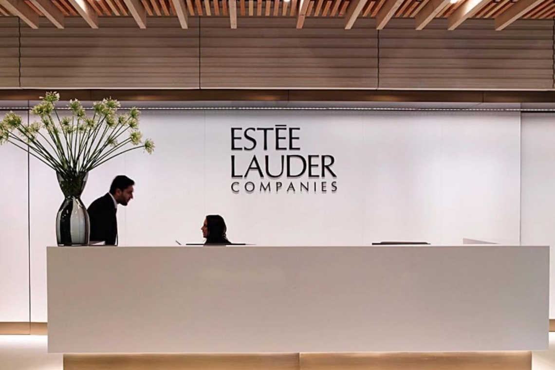
Estee Lauder applies a ‘clean desk’ policy to help keep the building clutter-free and enshrine the sleek chic aesthetic. To encourage productivity the office has utilised AI technologies to help people stick to work schedules; meeting rooms have digital signage that switch to the next meeting-holder’s brand.
Design inspiration has been taken from the London Underground. In the canteen the walls are decorated with underground maps, white metro tiles and motifs from London’s rich history.
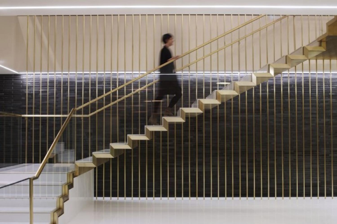
Everywhere you look are elevated furnishings such as plush velvet sofas, soft pile rugs and blue porcelain tables. Suspended by brass-clad steel hangar rods the staircase is a striking centrepiece and makes way for the finest collection of original art (courtesy of the company’s personal art curator).
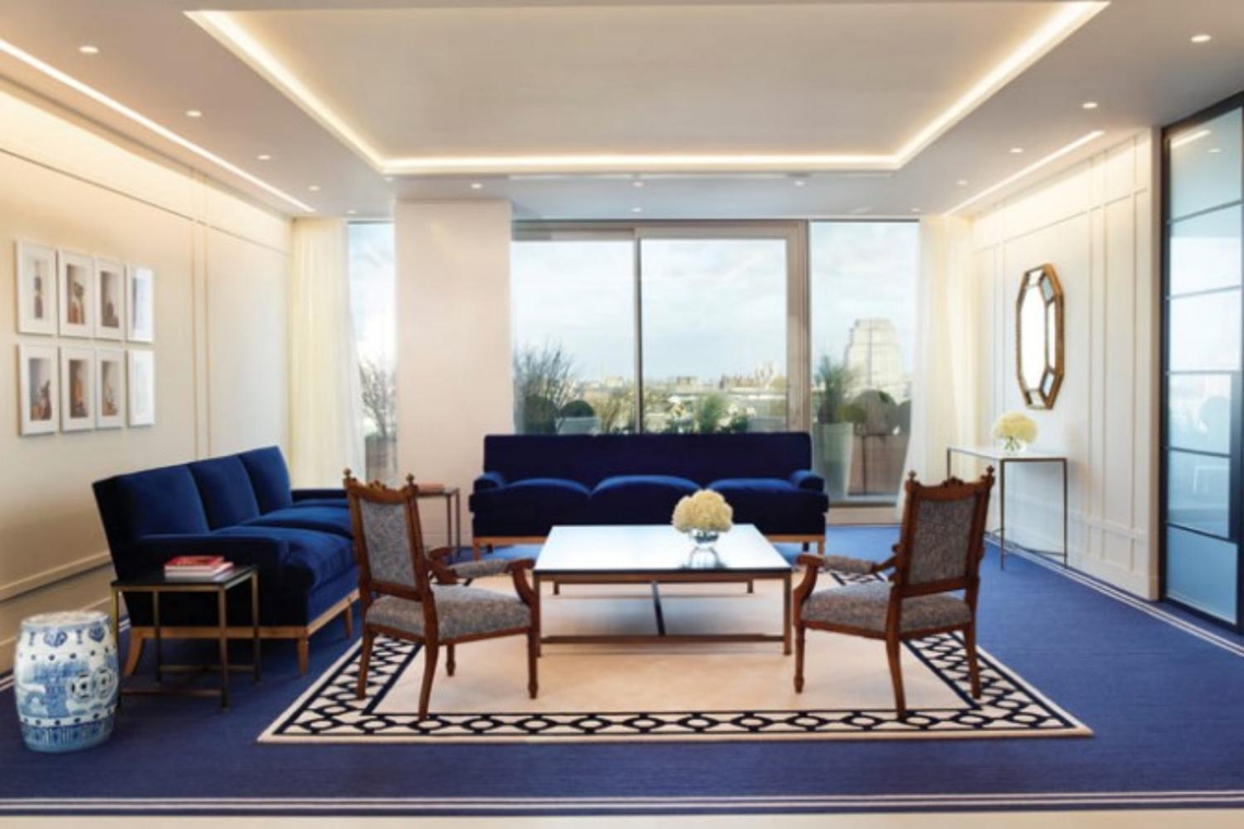
MCM clearly know their client; premium, efficient and business-focused, so have designed the interiors to continuously inspire and motivate employees to develop and progress the brand every single day.

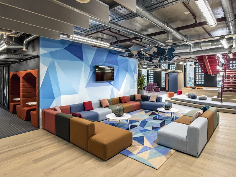
To build a space that encouraged and showcased their creativity, Adobe worked with Gensler to create their new London h…
TECHNOLOGY & IT
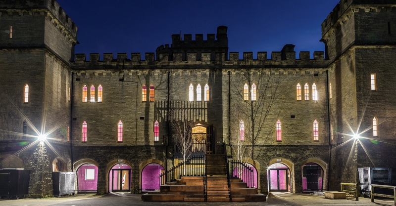
Cotswold-based comparison website creates a castle fit for the Kings and Queens of Tech, directing the transformation o…
FINANCIAL SERVICES
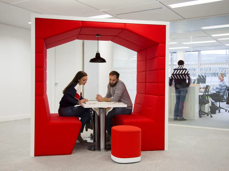
Creating a light-filled, flexible and interactive environment for electronic signature technology provider, DocuSign's …
TECHNOLOGY & IT