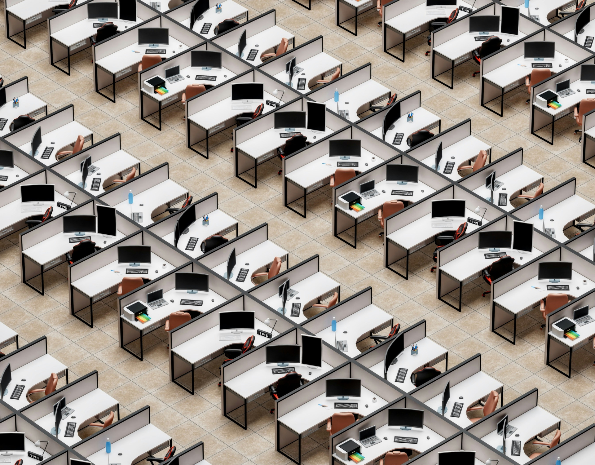
The Workplace Jigsaw: Piecing Together the Bigger Picture
Paramount in the world of workplace, the piecing together of feedback, experience, demands, trends and futureproofing is a huge strategic jigsaw puzzle, which follows a constantly evolving image on the front of the box. The ultimate challenge lies in curating a cohesive, efficient, and inspiring environment which delivers on organisational goals, attracts top quality talent and progresses the company towards its overarching mission. "The Workplace Jigsaw," delves into the different pieces of this puzzle, providing insights into mastering floorplans, wayfinding, understanding users, and applying retail design principles to your commercial workplace scheme.
The Lay of the Land – Mastering a Floorplate
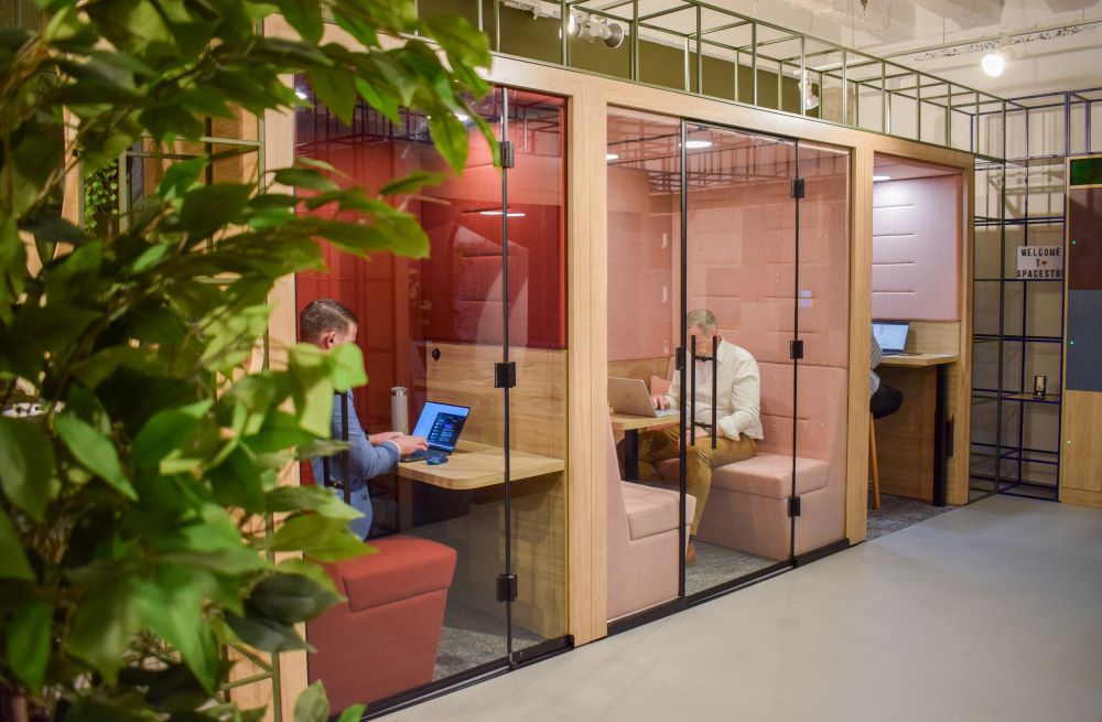
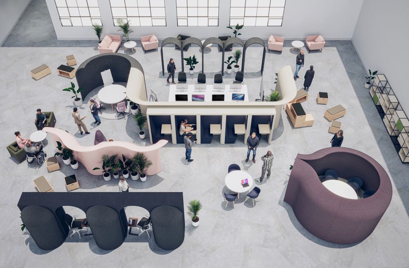
The foundation of a workspace that works for its users is a well-considered floorplate. An effective layout involves more than furniture placement; it requires a proactive assessment and creation of an environment where different spaces interact seamlessly to support various work styles and a diverse workforce.
Global companies are putting significant thought into the placing of workstations and collaborative areas. One of the reasons for this is in the interest of privacy and user comfort, establishing standards and best practices for where to place focus and quiet spaces in relation to hubs or collaborative zones. Another reason for this careful placement is to boost visibility and communication, multiplying chance encounters and cross-department collaboration among team members.
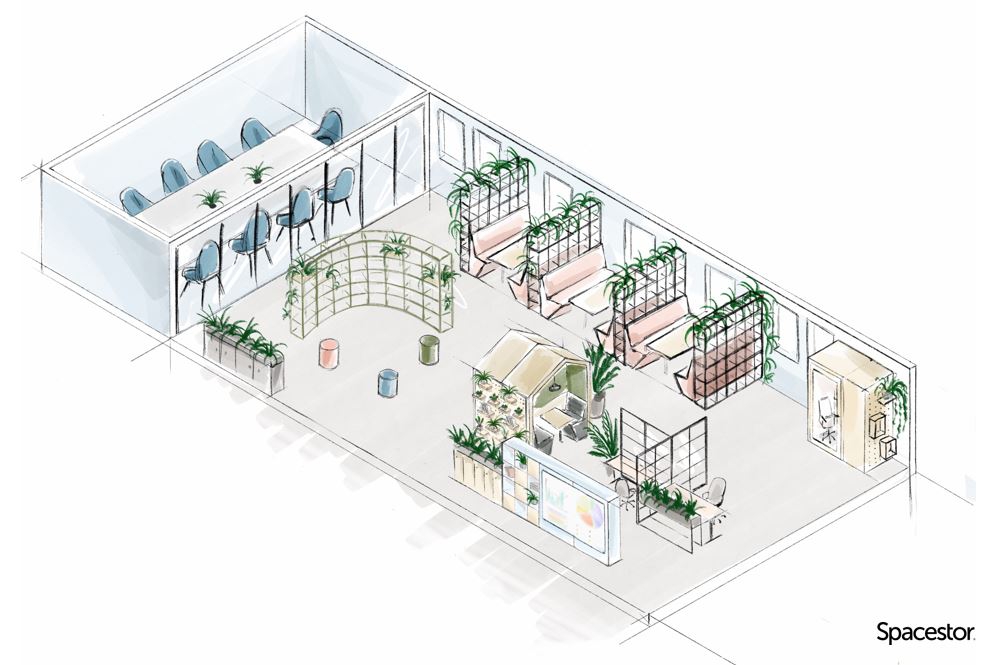
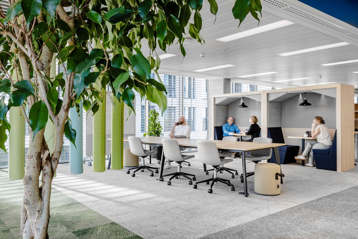
Embracing the intricacies of your building shell in details such as pipes, wires, pillars and windows can enhance the experience within a space. Positioning workspaces to maximize natural light boosts wellbeing and productivity, whilst utilising the existing architecture and pillars within a space to define zones and areas can maintain clarity and sightlines.
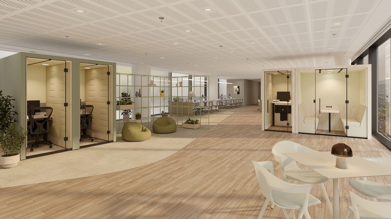
It is accepted that diverse spaces are crucial in today’s workplace. Blending collaborative areas, single-user zones, quiet rooms, and large conference spaces not only cater to different working styles, but provide autonomy for associates to choose the environment they work in. How these different spaces interact and progress throughout a space is important, to ensure the floorplate doesn’t merely look great, but makes sense to the user and assists change management.
As a space is a physical manifestation of an organisation’s brand, the flow of a floorplate should reflect the culture and desired role of the workplace, whether free flowing, looped or segmented, and help promote interaction or distinction in the space.

Wayfinding & Designing for Neurodiversity
A workspace should be easy to navigate and inclusive for everyone. Clear wayfinding and thoughtful design for neurodiversity are crucial components of an accessible office environment.
Designing intuitive pathways from the entrance, making areas easy to find and providing available retreats from bright lights or noisy areas is important. This involves clear visual cues, logical spatial organization, and minimizing complex navigation, with unobstructed pathways around the office.
Use clear, accessible signage to guide employees and visitors should feature high-contrast text, simple language, and universal symbols. Braille and tactile signs enhance accessibility for visually impaired users. Digital wayfinding tools, such as interactive maps or mobile apps, can further aid navigation, and can be synced into the company’s space-booking software.
Thoroughly planned change management can cater to a neurodiverse workforce with comprehensive onboarding and clear explanations of space provisions, as well as awareness for all around how the space can work for them. Offering sensory-friendly spaces with adjustable lighting and acoustics, quiet zones, and private rooms are helpful as workplace can often be unnecessarily triggering.
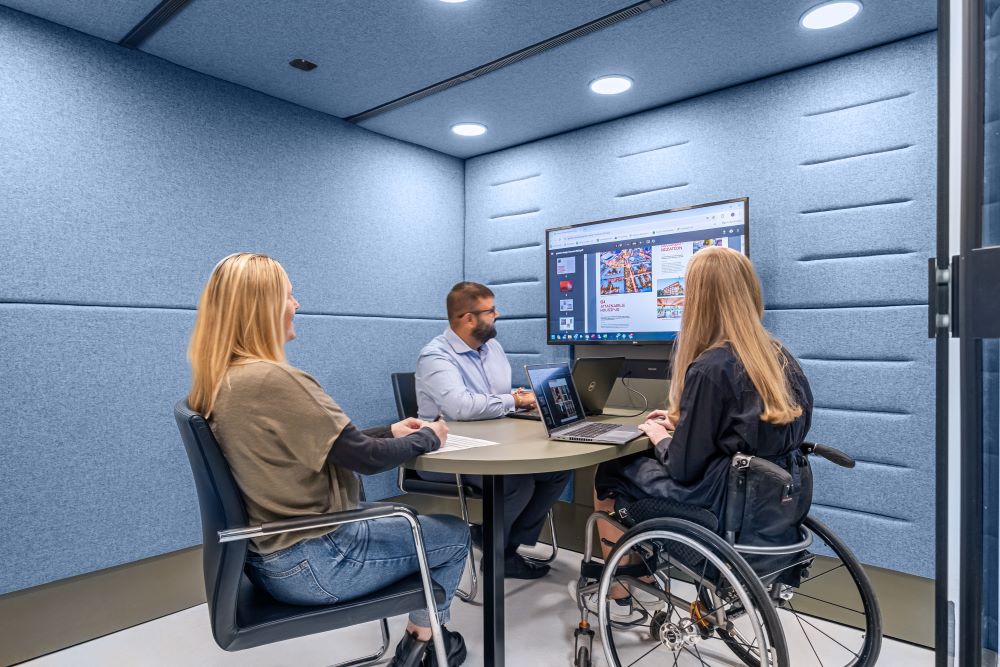
Understanding Your User & Gathering Data
Understanding how people use the space and what they need is essential to completing the jigsaw puzzle. Engaging with employees through surveys, focus group and direct interaction in the space is important to gather honest feedback. A data-driven approach helps identify pain points, preferences, and usage patterns, as well as providing justification for strategy decisions.
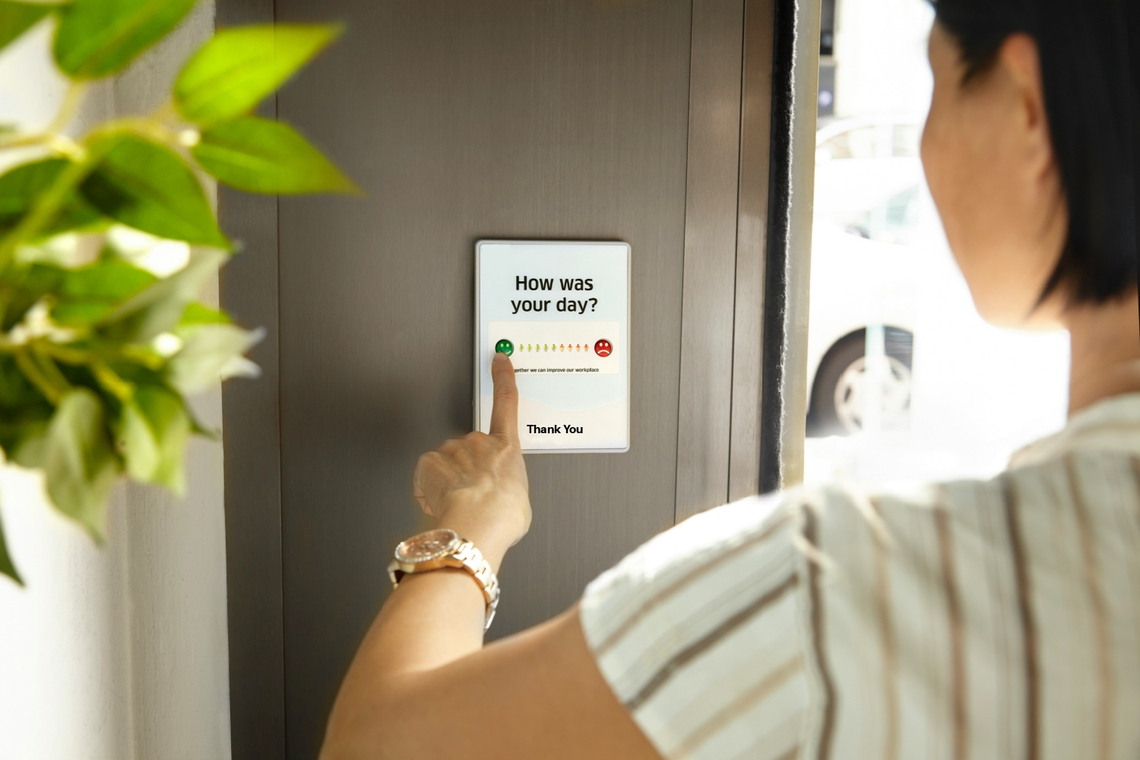
Sensors can track movement, occupancy, and environmental conditions, providing real-time data on space utilization. Establishing a system of feedback through QR codes and fostering a culture of improvement will encourage employees to recognize their role in aligning the workplace with their needs.
Closely observing how employees interact with the space reveals gaps between expectation and what really happens on the ‘front line’. As the role of the workplace evolves, it provides something different for each organisation, and an office that was thought to be a collaboration hub with a ‘clubhouse’ vibe, may be valued by its users as the opposite – a space to focus and get stuff done.
Applying Retail Design to Your Office
As employees become customers in today’s talent market, incorporating retail design principles can create an engaging environment that meets employee needs and reinforces the company’s brand. Focusing on creating a compelling customer experience, seamless day-to-day functionality alongside attractive amenities is the key for a retail space. This emphasises the importance of the location of the office, what shops and facilities are in the vicinity, and what opportunities there are to support the local community.
The reception area should reflect the company's brand and culture, creating an inviting entrance that sets the tone for the workplace experience. Making a strong first impression with comfortable seating, welcoming decor, and friendly staff contribute to a positive experience upon entry.

Moving into the space, consistent branding through subtle colours, logos and messaging helps to build a sense of belonging and brand awareness. Custom artwork, themed areas and personal touches work well to add an irresistible personality and uniqueness to a workplace, incorporating spaces that employees can ‘make their own’.
Like promotional displays in retail, highlighting key initiatives or areas of interest to maintain engagement and keep employees up to date with company news, events or achievements. Feature displays or focal points that showcase current projects or highlight employee stories are innovative design pieces as well as a medium to build awareness throughout departments.
Another pillar of design which transcends retail and becomes part of the workplace experience is the engagement of all five senses. Visual appeal is crucial, but incorporating pleasant and distinct scents, background music which varies according to the type of space and tactile, kinaesthetic elements contributes to a multisensory space which becomes a destination workspace.

The bigger picture is a complex collection of moving pieces, a jigsaw puzzle which constantly evolves with the role of the workplace. Different for every organisation, and everybody, the daunting task of creating a space that works can be achieved by mastering a floorplate and placement of spaces, considering for neurodiversity, thoroughly understanding your employees needs and incorporating retail design principles to enhance user experience.



FINANCIAL SERVICES
A triumph for Revel Architecture, where the result is a workspace that not only looks stunning but sings of it surround…
SCIENCES
Edelman’s new home is a sustainable, socially supportive space which is highly aligned with the organisation’s brand an…
PROFESSIONAL SERVICES