July 1, 2019
Cool Workspaces
Reliance Brands Limited, a company that brings iconic fashion brands to India recently engaged Space Matrix to design their offices in Gurugram, India.
Reliance Brands Limited is a company which houses some of the biggest names in the fashion and retail industry. Where in most cases, workplace branding goes hand in hand with homogeneity in terms of colour palette, design scheme, cultural nuances and vibe, this company envelops multiple brands with a host of diverse teams, each with their own unique way of working. This means that teams working from within their offices are equally diverse. Space Matrix recognised a single, homogenous brand experience would never work.

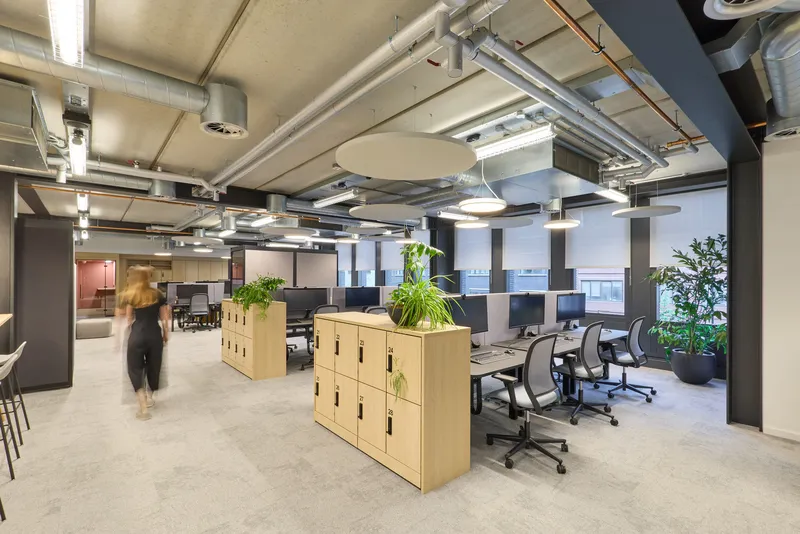
Although open offices have their merits, they can be distracting and disruptive if not thoughfully designed. RBL's offices are divided into small clusters or 'neighbourhoods', each with their own work areas and huddle spaces. Each neighbourhood has a unique vibe and functionality, allowing teams to operate within an atmopshere that works for them, whilst maintaining overall brand unity. This goes a long way in improving workspace productivity and minimising the disruptions of a typical open office environment. Giving employees a unique niche to work from also instils a sense of belonging - employees feel more at home within their own neighbourhood than they do in a completely open office environment.

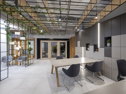
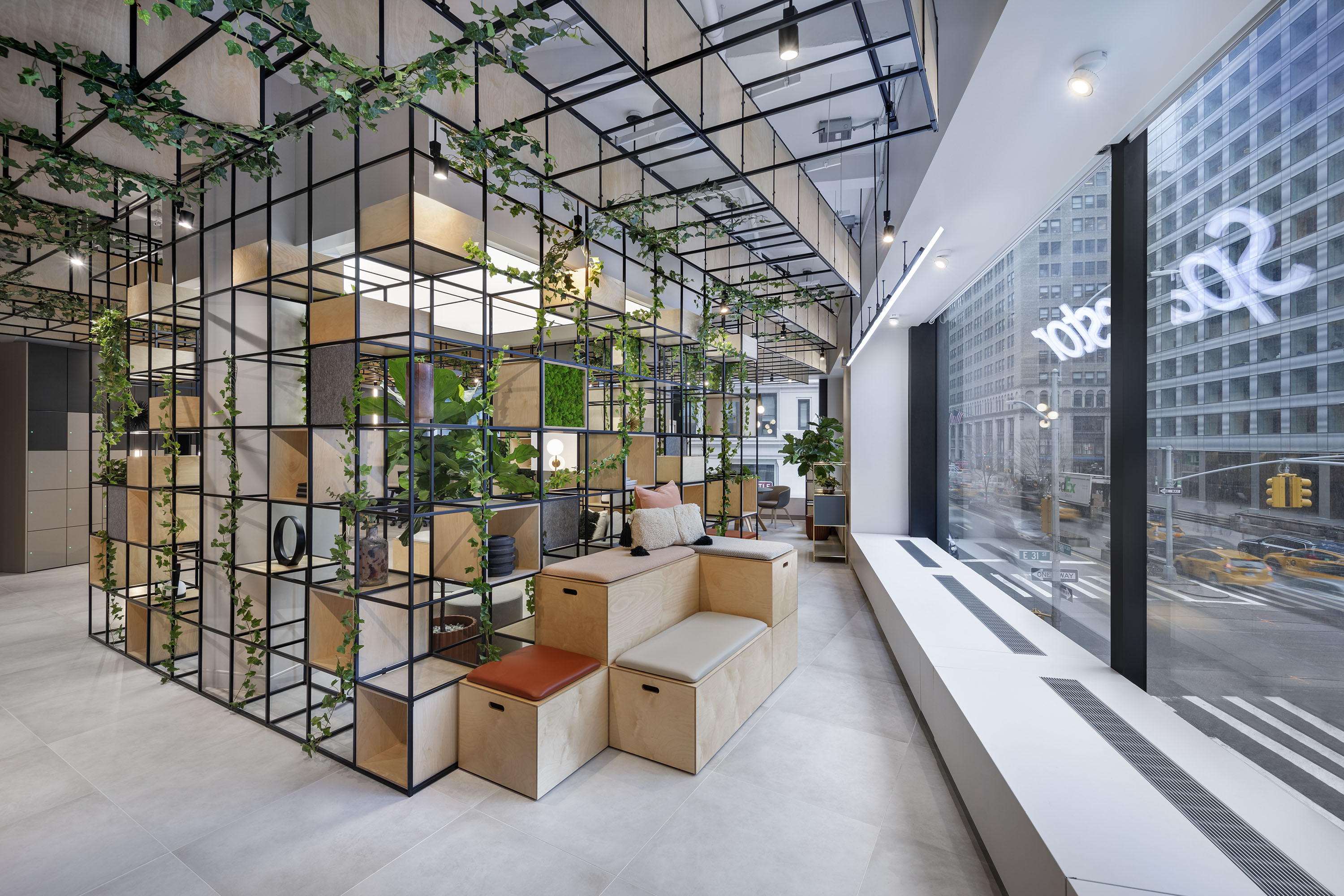
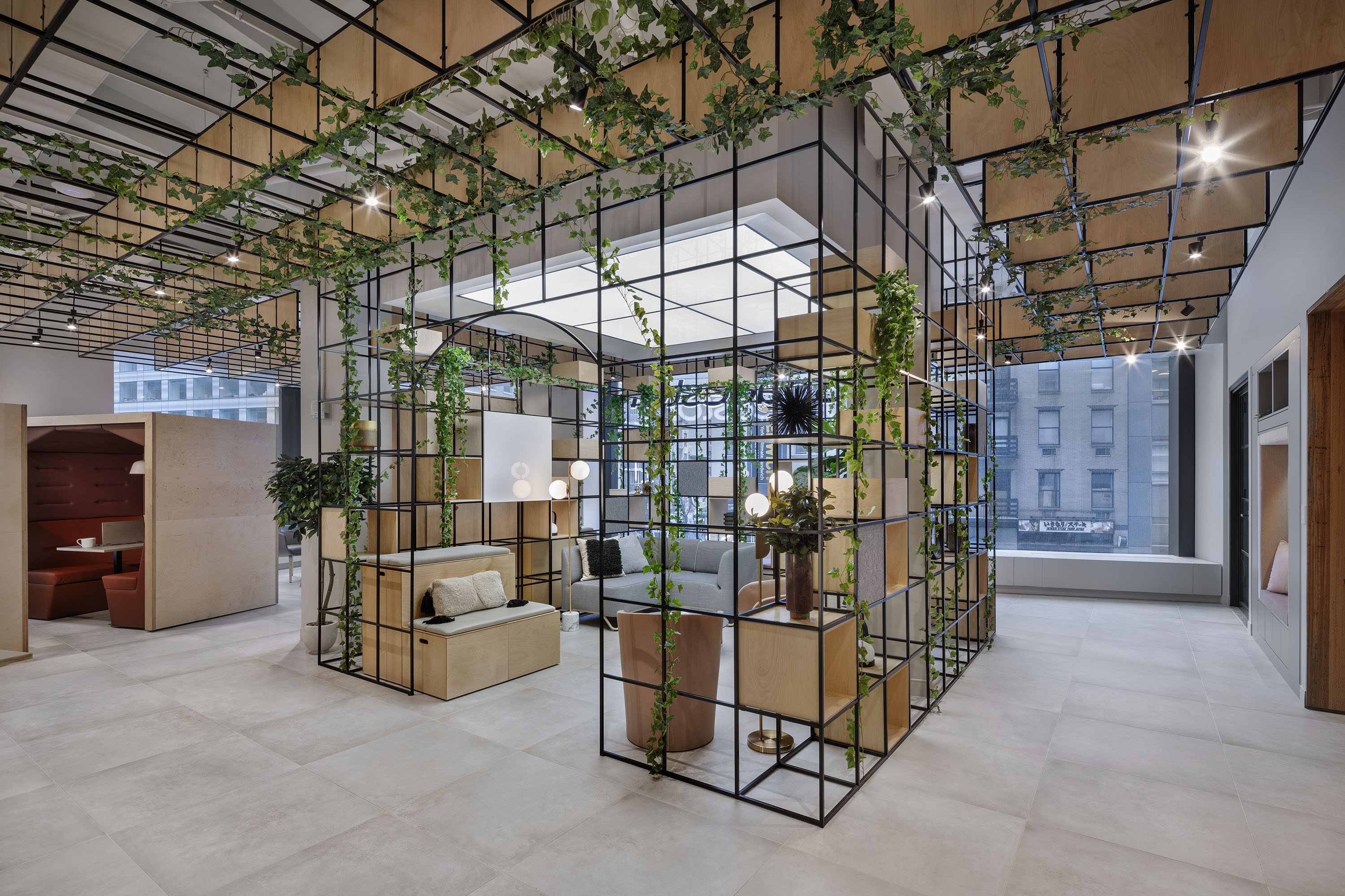
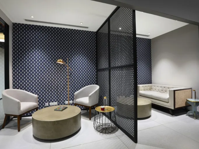
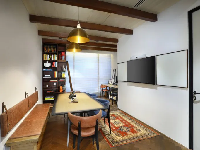
Finding ways to fragment floor space in an open plan office, is essential. In RBL's offices, metal and wood screens have been used to divide up the floor space. As well as being functional, the different textures help to incorporate a unique character to each nook. Additionally, centrally located glass-walled offices and collaborative meeting rooms helped to break up the monotony of a large space, creating privacy whilst retaining the open feel.
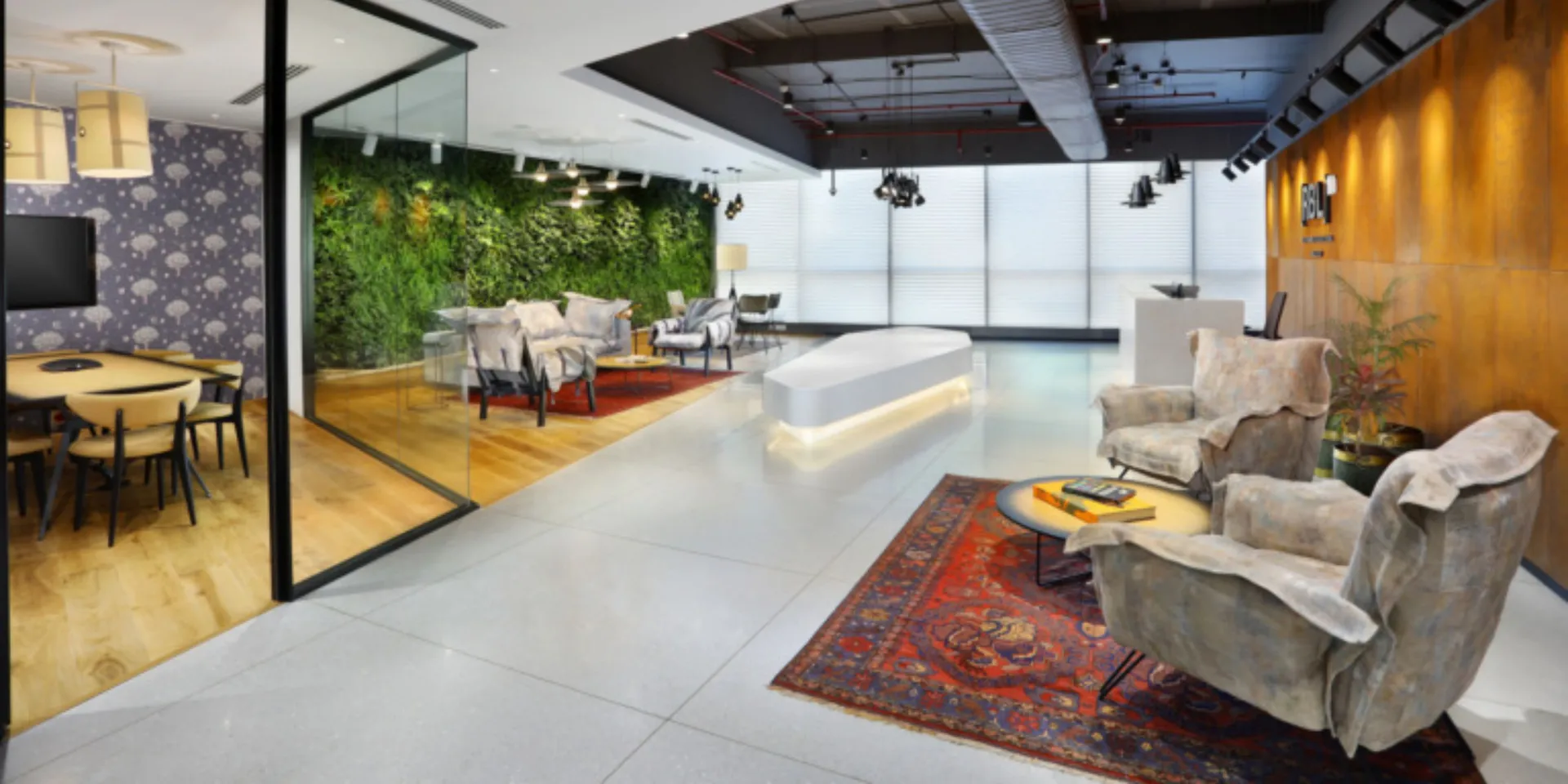
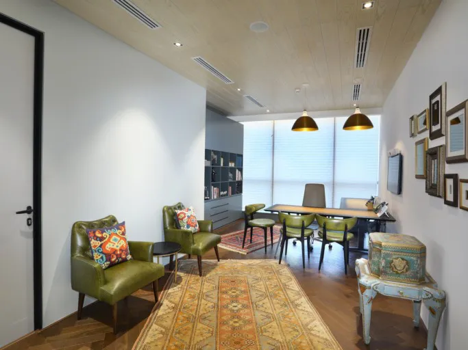
Adequate visual variety has also been included, by playing around wtih contrasting vibes. Some neighbourhoods are comfortable and modern with cushy white sofas and armchairs, whilst in stark contrast, other neighbourhoods exude an antique vibe - with retro olive green chairs, intricate rugs and distressed details.
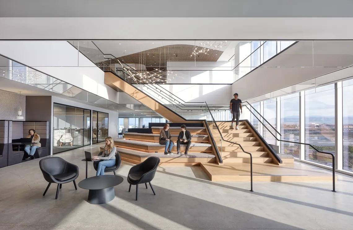
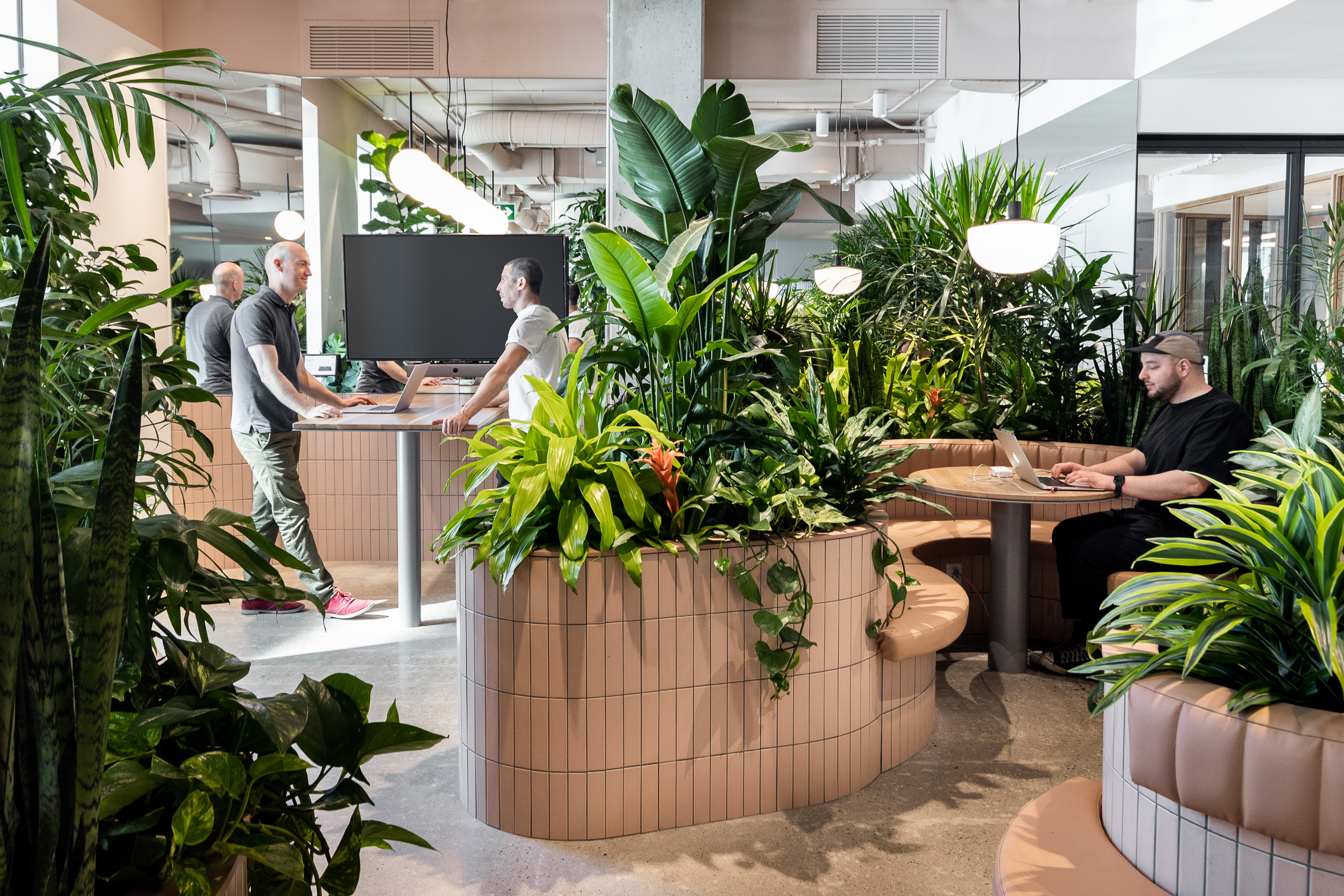
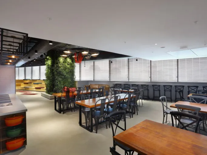
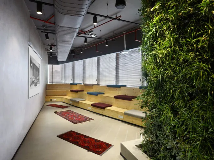
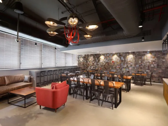
Other than the look and feel, the way a space functions also can help it stand out from an adjacent nook. An example of this is the Apex in the RBL office - with glass walls, it is not visually cut off from the surrounding work area, but is comfortable and gives the space some acoustic privacy. The cafeteria is another example of another functionally distinct zone. With greenery, an accent wall done up with printed, discarded wood blocks and a cosy open step seating area, the space doubles up as a work café and a great spot to settle down in for a couple of hours with one's laptop and a steaming beverage.
Share this article
